Designing User Options for a Banking Cross-Platform interface
The product
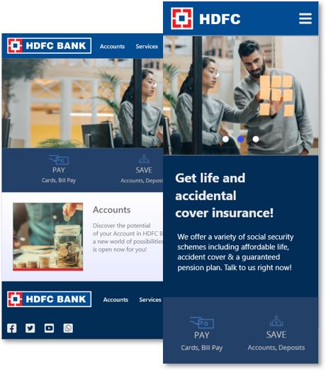
In this project, the creation and design of various user screens characteristic of a banking platform is carried out, this involves understanding the various options, tasks and functionalities that a user of this type uses in the interface to achieve their objectives and cover their financial needs.
The problem
The problem is the creation of the interface of a banking platform that adjusts to the particular needs of a user who uses financial services, so that he or she can carry out all their procedures efficiently and expeditiously.
The goal
The goal is to design a user-friendly, intuitive, user-friendly interface that considers utility, usability and satisfaction criteria.
My role
I am the UX designer that has been asigned to concept the banking platform.
Project duration
September to October 2021.
User research: summary
I conducted an user reseach to validate the initial assumptions of the user. We´d like to figure out what specific difficulties users find when they interact with the inteface. We will measure effectiveness by the agile and quick time response where the user is and by the satisfaction perception during and after the use of a financial service.
Among the research questions I include: What are the main difficulties users experience when interacting with the web?, Can users finish a task into the interface?, Can the user give response form the interface?, Can the user interact with the different functionalities to get financial products?, Is the user satisfied with the use of the web interface?
User research: pain points
Responsiveness
Many of the options available to users in the web interface are not adequately compatible with the mobile version.
Visibility
Many of the access options to services provided by the platform are not easily identifiable within the system.
Accessibility
The different options of the system do not consider any type of adaptation to user profiles with some level of disability.
Security
One of the biggest observations from users is the information security criteria due to current cybersecurity problems.
Persona: Gabriel
Problem statement
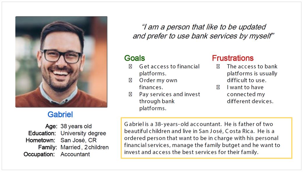
Gabriel is an accountant who uses regularly financial services for your work and personal life who needs granted access to a secure banking platform that let him personalize their experience because he is a trust person who cares the financial services and want to use the most secure and updated.
User Storie
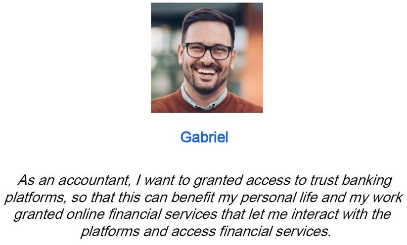
As an accountant, I want to granted access to trust banking platforms, so that this can benefit my personal life and my work granted online financial services that let me interact with the platforms and access financial services.
User journey map
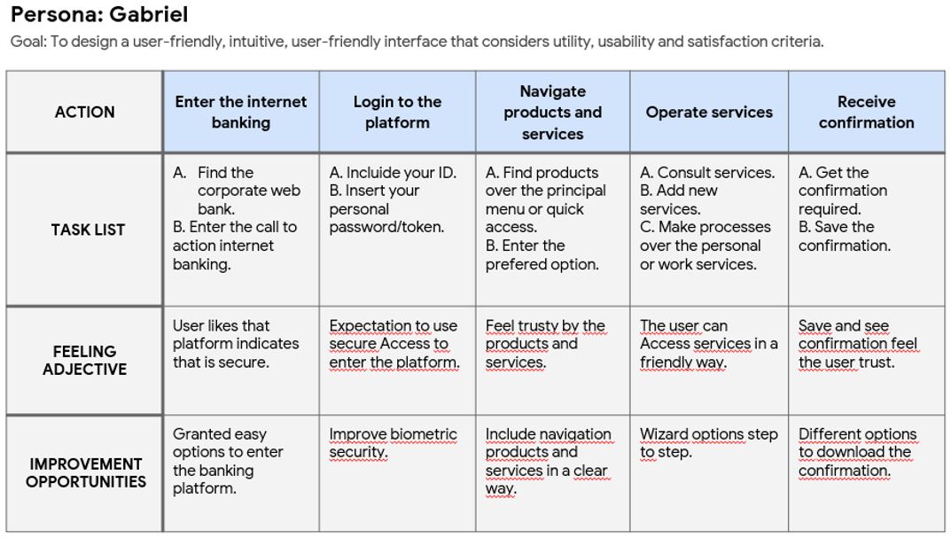
The user journey map define how to interact in the banking platform getting products and services securely and in an inform way.
Sitemap
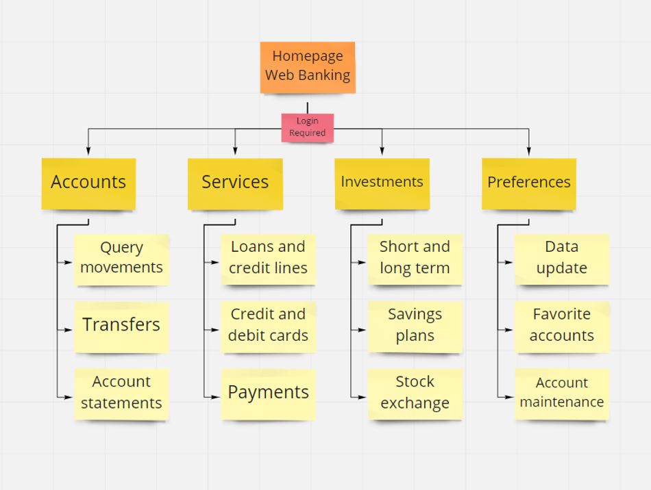
The site map includes an information architecture that integrates main options such as accounts, services, investments, preferences, profile, among other user access options.
Paper wireframes
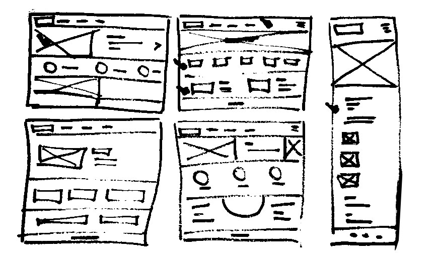
The exercise of crazy 8´s let create different sketches for the banking platform including a refined version of the initial screens created with this technique.
Wireframe screen size variation(s)
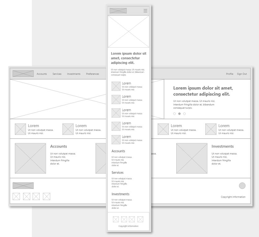
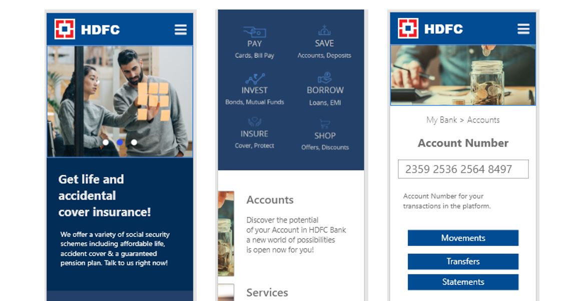
The banking platform user enter the web interface in a variety of different devices, starting on a web site and changing to addional screens like the mobile and responsiveness.
Digital wireframes
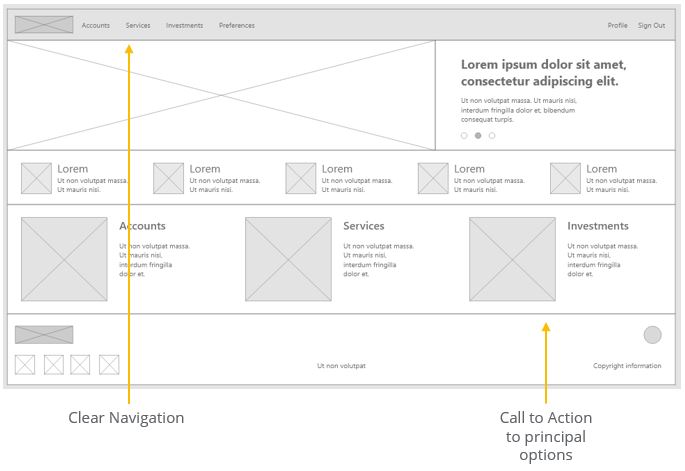
The digital wireframe includes clear navigation options and call-to-action options related to the products and services offered by the bank.
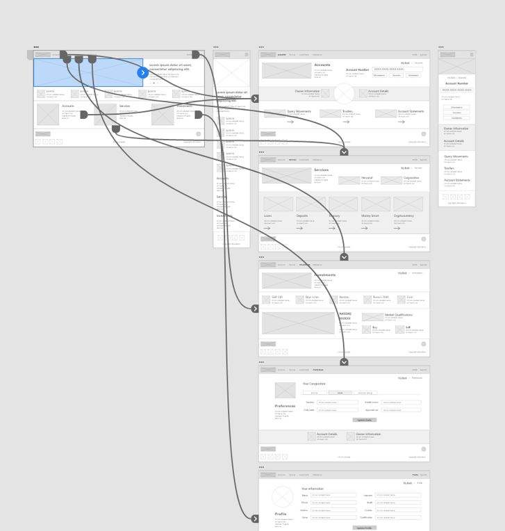
Low-fidelity prototype
The wireframes are chained in a way that allows accessible user navigation that includes navigation through the main menu, secondary menu options, and interconnection of options within the interface.
Usability study
- Study type: Moderated usability study.
- Location: Costa Rica, Remote.
- Participants: 5 participants.
- Length: 20-30 minutes.
Finding 1
Navigation
Navigation refers to having different alternative ways of being able to interact with the content including first and second level options.
Finding 2
Security
Security is one of the key criteria for users, so it is important to incorporate security validation criteria.
Finding 3
Findability
The ease of finding and accessing new banking services and products is key for the users interviewed.
Mockups
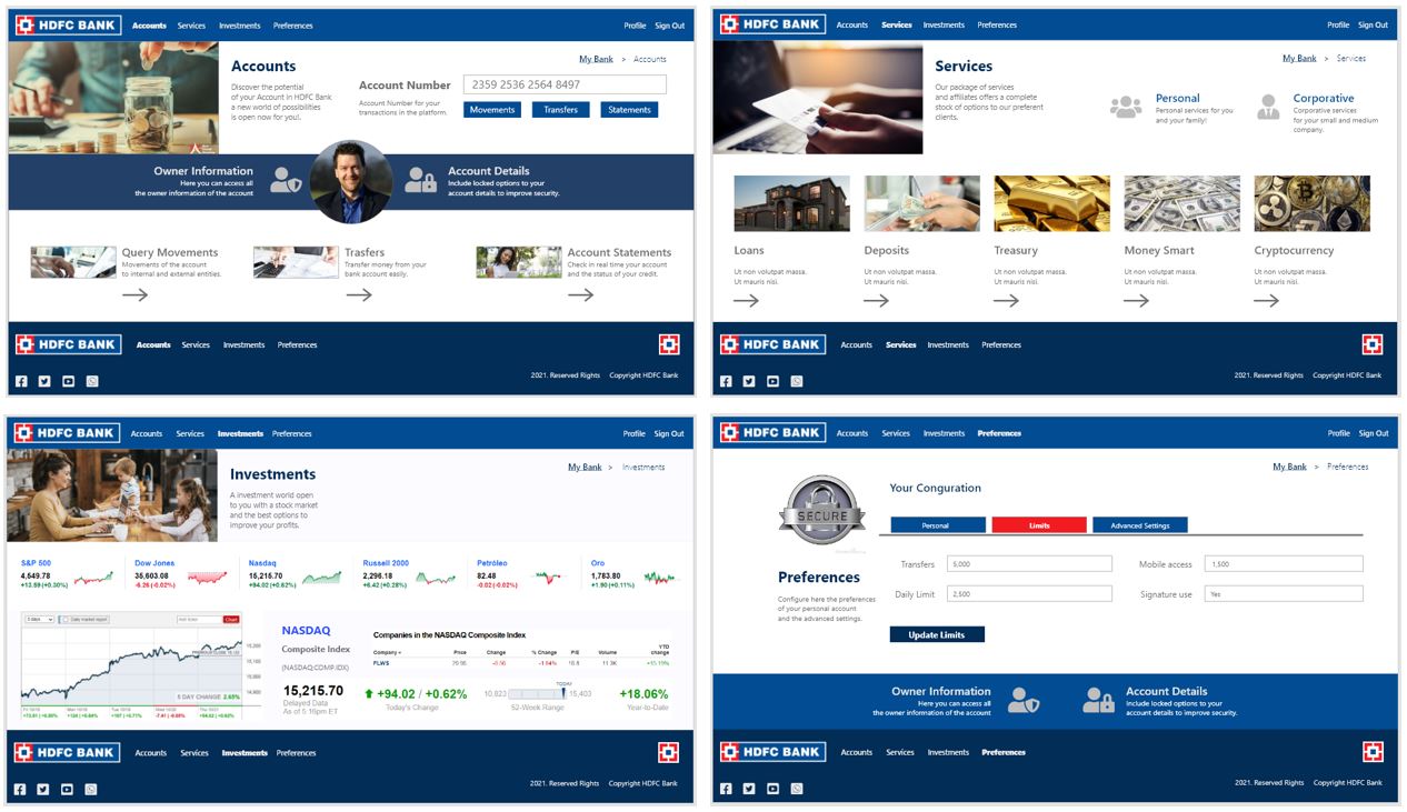
From the results of the usability study, it was determined to make an improvement in the visualization of the interface, which was implemented in the contrast level of the various available options.

One of the comments from users was related to the availability of information, this can be seen in the improved version of screens such as the investment screen with more detailed information.

High-fidelity prototype
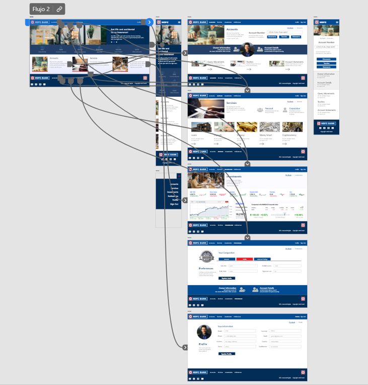
The high-fidelity prototype reflects the needs of the users and considers the improvement of the pain points identified in previous stages.
Accessibility considerations
The dimensioning of the different components used in the interface must allow interaction in both PC-type devices and mobile devices.
The color contrast is one of the key accessibility elements to be able to give clarity to the user and that he can successfully achieve the required tasks.
Finally, another of the accessibility attributes considered is the content itself, which must be clear and precise for the user.
Takeaways
Impact
Specific applications for sectors such as banking have important implications for users, they must be clear and precise, provide useful information and must be able to adequately process each of the transactions that the user requires in a reliable and secure manner.
What I learned
I have been able to learn that applications of this type must be analyzed carefully in order to deliver a satisfactory end-user experience.
Next steps
Perform a new iteration with the user to be able to refine the design and improve the high-level prototype.
Carry out careful checks related to the security criteria required for the use of the banking platform.
Conduct more user research to determine any new areas of need into the design.
Thank you for your time reviewing my work Designing User Options for a Banking Cross-Platform interface.
If you´d like to see more of get in touch, my contact information is provided below.
Email: contacto@andresbertozzi.com | Bio: https://andresbertozzi.com/bio/
