Design a tool to help people invest money regularly as an alternative to pension
The product
The design a cross-platform tool to help people invest money regularly as an alternative to pension project was conceptualized as a financial alternative so that people can have options for financial products for their old age.
The problem
Having a future pension and enjoying a comfortable old age becomes more complicated every day, it is necessary to have a series of financial tools that allow us to fulfill this purpose, which is why the creation of an application that ensures this is proposed. kind of people and give them tools for their future.
The goal
Develop a financial management platform that provides tools to people from their youth to have financial resources available for their future life as a pensioner.
My role
I am the UX designer that has been asigned to concept the banking platform.
Project duration
October to November 2021.
User research: summary
I conducted an user reseach to validate the initial assumptions of the user. We´d like to figure out what specific difficulties users find when they interact with the interface. We will measure effectiveness by the agile and quick time response where the user is and by the satisfaction perception during and after the use of a financial service.
Among the research questions I include: What are the main difficulties users experience when interacting with the web and mobile?, Can users finish a task into the interface?, Can the user give response form the interface?, Can the user interact with the different functionalities to get financial products?, Is the user satisfied with the use of the web and app interface?
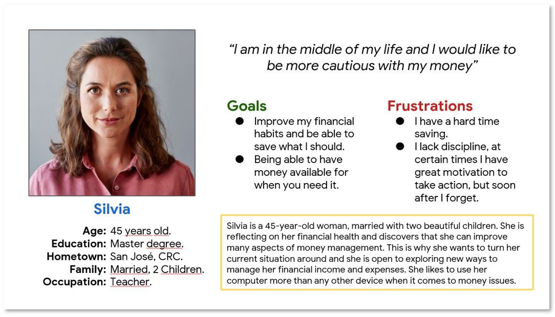
Persona: Silvia
Problem statement
Silvia is a wife and mother who needs improve your financial habits to be able to sabe what she should because she wants to turn her financial situation and explore new ways to manage her incomes and expenses.
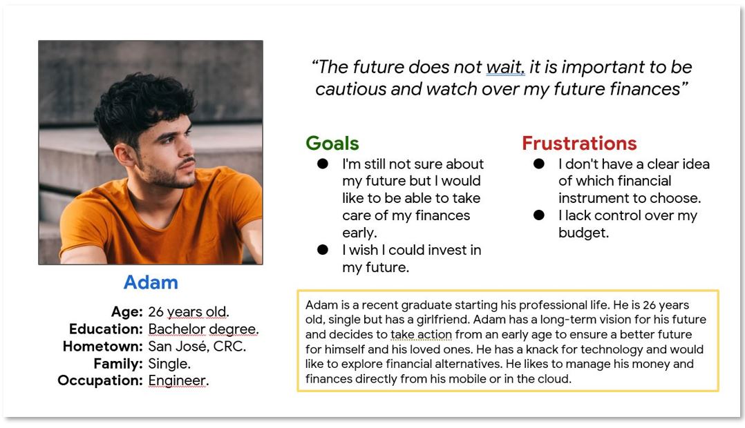
Persona: Adam
Problem statement
Adam is a Young profesional who needs to be able to take care of your financies early in his life because he wants to ensure a better future for himself an his loved ones.
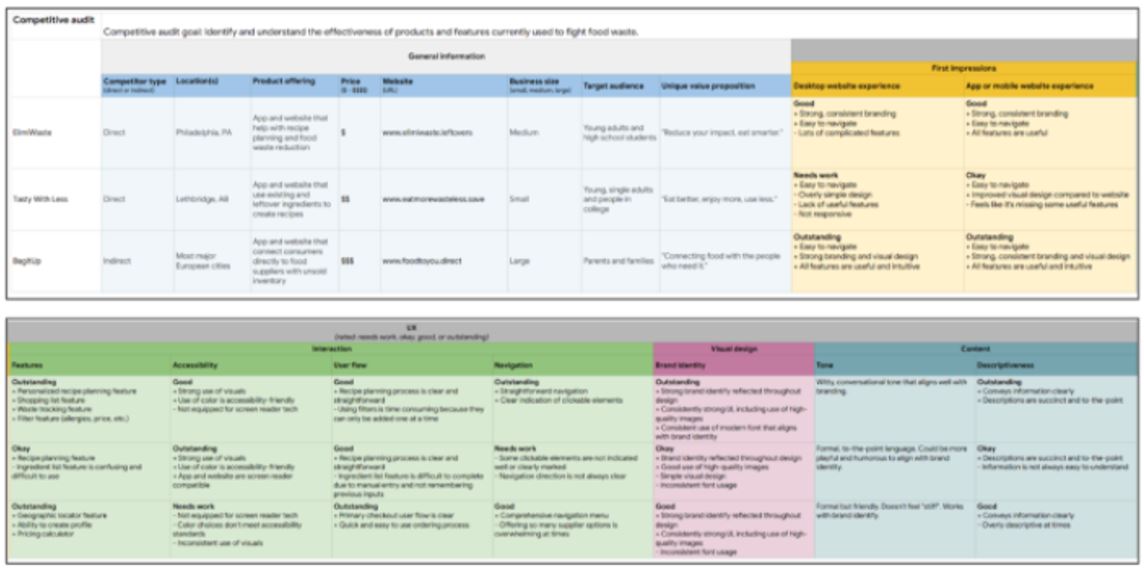
Competitive audit
The competitive audit is used as a way to search for possible competitors, in this case it referred to Fintech-type products in which financial products are presented for users in the short, medium and long term, the reference allows to obtain a number of hits and mistakes of this type of product.
Ideation
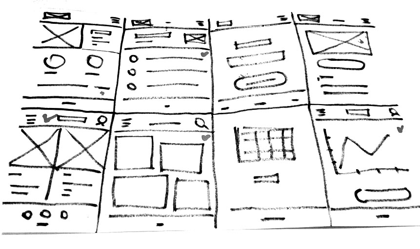
The ideation stage allowed the creation of a series of possible interface screen options, which allowed to open the possible conceptualization of the product through the technique of a Crazy 8’s.
Digital wireframes
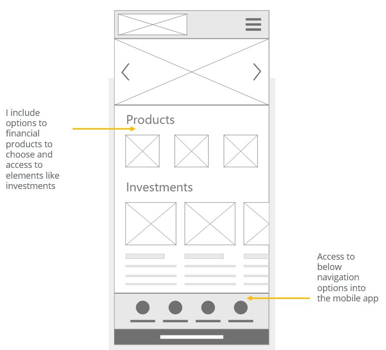
The wireframes allowed the idea of interesting options for users such as having access to products and investments, as well as a quick navigation bar.
Low-fidelity prototype
The low fidelity prototype allows the visualization of how the different screens of the digial products in their mobile version will work.

Usability study
- Study type: Moderated usability study.
- Location: Costa Rica, Remote.
- Participants: 5 participants.
- Length: 30-60 minutes.
Finding 1
Multi-platform
It is important to consider the differences between the different platforms that the user will be using.
Finding 2
Age and Ability
The age criterion becomes a key aspect in the project since users will have different levels of ability to access technology
Finding 3
Culture
The vision of users to use the platform as a means of generating long-term economic resources is a challenging cultural element in the project.
Mockups
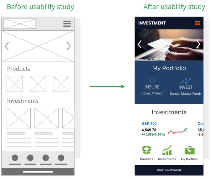
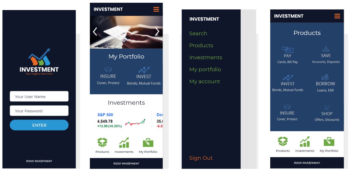
Based on the findings resulting from the usability studies, it was detected to incorporate improvements in the navigation processes and in the shortcuts.
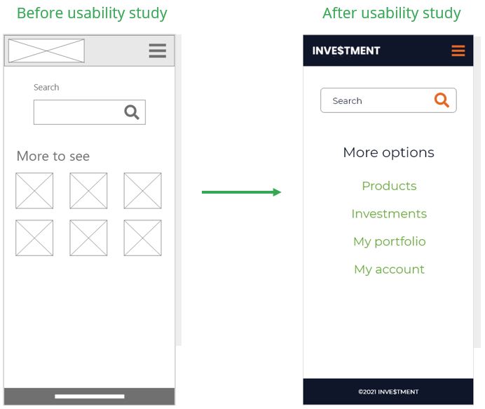
Changes in the search section that would give more direct options to the main sections of the interface were also proposed by users.
High-fidelity prototype
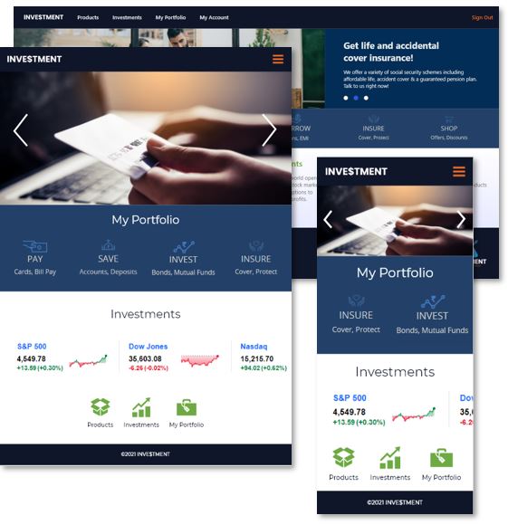
The high-fidelity prototype allows to validate the assumptions that were raised in the ideation stage, refining detailed issues in the user interface.

Accessibility considerations
The different options of the system do not consider any type of adaptation to user profiles with some level of disability.
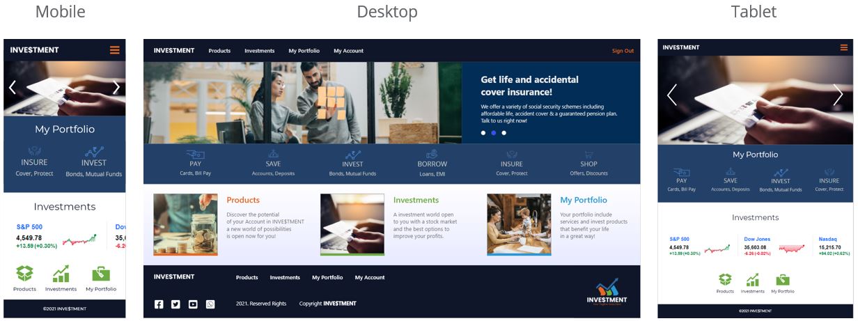
It is important to consider the responsiveness of the interface and with them the dimensions of the various elements as an accessibility criterion.
Finally, it is important to consider the cultural differences that users may present with financial terms, especially if this is an application that would be used in different countries.
Sitemap
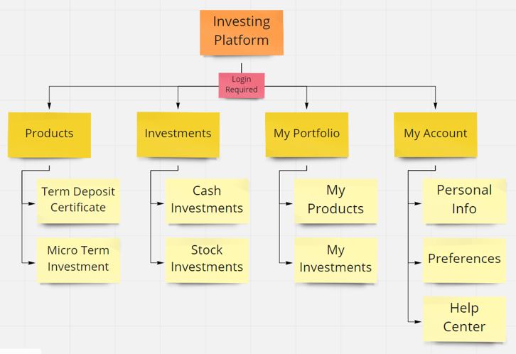
For the site map of the investment management platform, a simple hierarchical navigation scheme was proposed that allows access to the different functions of the interface in a practical way.
Responsive Designs
Takeaways
Impact
Responsive cross-cultural applications are a response to the specific needs that users from different environments may have when faced with varied and diverse contexts of use, the design of this project demonstrates how it is possible to adapt projects to this scenario.
What I learned
As a learning I have managed to understand the importance of multiplatform applications as a means of communication with users in various contexts.
Next steps
Perform a new iteration with the user to be able to refine the design and improve the high-level prototype.
Carry out careful checks related to the security criteria required for the use of the banking platform.
Conduct more user research to determine any new areas of need into the design.
Thank you for your time reviewing my work Designing a tool to help people invest money regularly as an alternative to pension.
If you´d like to see more of get in touch, my contact information is provided below.
Email: contacto@andresbertozzi.com | Bio: https://andresbertozzi.com/bio/
